#design #development
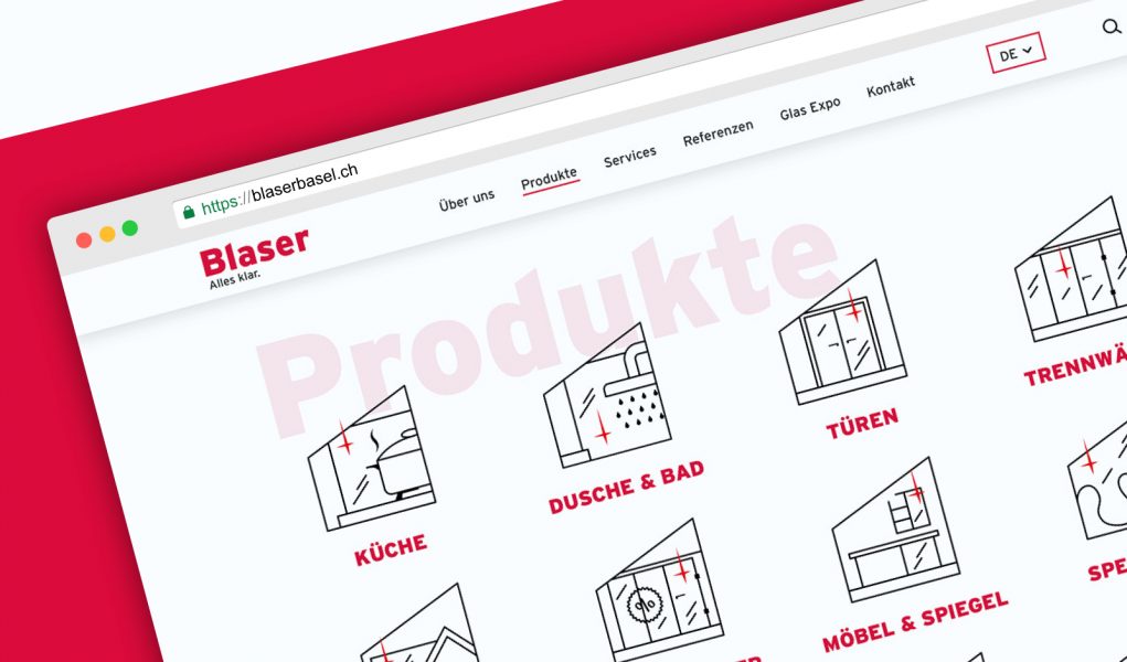
In recent months we had the pleasure to work with fantastic team from Blaser Bauglas AG on renovation of their company website.
As innovative, forward thinking company, they wanted the website to reflect their style.
Bright, light, modern.
We designed a clean layout with Blaser promo video in hero section to showcase their workflow and to make bigger impact on users. The rest of the page highlights their products and services with videos and descriptions, accompanied with multiple product galleries.
We aimed to emphasize their innovative approach with designing a set of unique icons depicting the product categories.
To fill the page with a bit more dynamics we transferred the rectangle shape from Blaser’s logo into graphic elements filling out the page.
As we always strive to increase the performance of our products, and in accordance to recent GDPR changes, we took an innovative approach, to customise the map of the contact area and draw it in style synchronised with overall design.
That set our path for the contact section in following projects.
Created a user-friendly backend, allowing the client to fill easily the news section and updating their product pages.
After 6 months we went live with a bright, clean website, showcasing all the qualities that the client aims for.
We are very thankful for this cooperation!


